Ideation
I have a bias towards minimalist logos because they are
- Simple – easy to draw and recognize
- Flexible – can be used across more media and highly customizable
- Timeless – doesn’t follow trends
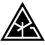
My concept is combining the letters of my name and forming a shape with it. Here’s some of my doodles.

After finalizing the form of the logo, it’s time to make it more professional.
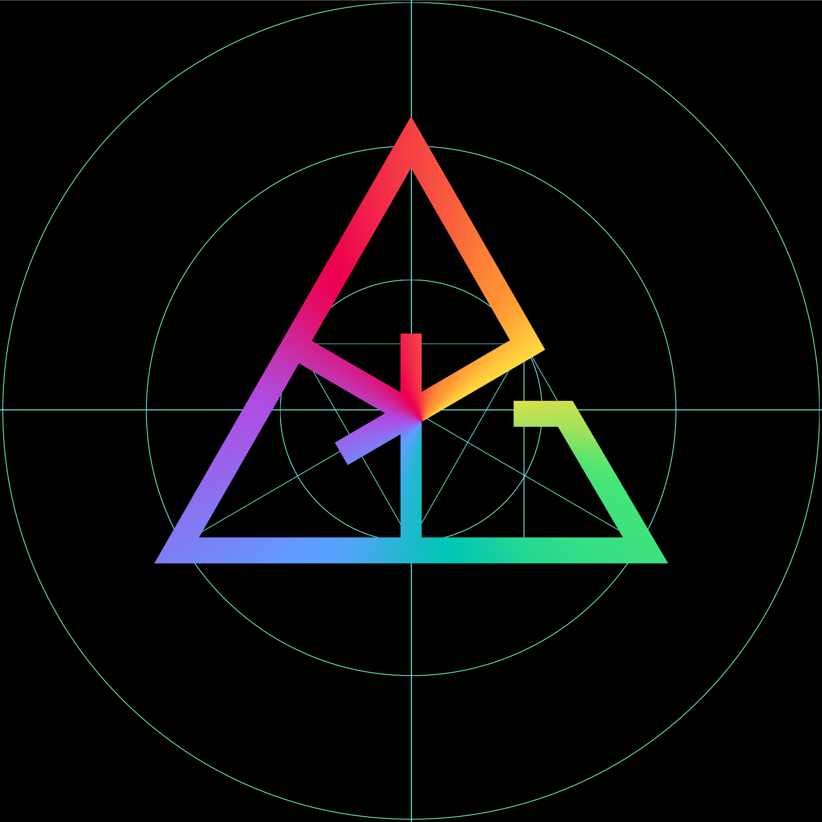
Execution
I started by first creating alignment guides for symmetry and asymmetry. Then, I drew the logo on top of it, adding more guides as necessary.

After completing its purest form, the next step is customizing it so it can grab people’s attention.
Customization
The first customization I did was adding a vibrant gradient as the foreground. This makes the logo pop-out in contrast to the black background.
The second was adding a subtle texture that made the colors look like digital screen pixels.
The finishing touch was adding a soft glow that further accentuated the digital screen effect.

In the future, I can do more color and stylistic variations of the logo.
So what do you think?
P.S. If you have seen any of my previous logos, you may recognize my signature design.
Leave a Reply